This page was last updated on October
2, 2004.
General Hospital is ABC's longest-running daytime drama series. It premiered on the same day as another medical drama soap, NBC's The Doctors.
Part One: The Early Years
 In at least the first
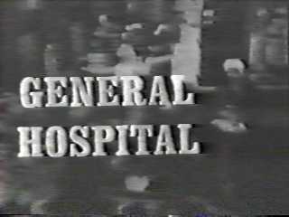
episode of General Hospital, the opening sequence begins with a close up
shot of the medical profession's serpents-on-a-staff logo sculpture on a wall.
Then the camera slowly pulls away to reveal nurses and doctors walking through
the nurses' station on their rounds. The picture freezes and turns into a
negative image as the title of the show appears in white Craw Clarendon
Condensed lettering. The theme music, composed by original organist Kip Walton,
was a rather expansive piano piece.
In later seasons, or at least from late 1964 to July 1976, there would be a pre-main title scene, at the end of which the title would be superimposed over the visual (a la The Doctors). The title would stay on screen for a few seconds as the scene in the background faded to black (or blue after General Hospital began broadcasting in color).
In the spring of 1975, Kip Walton's original General Hospital theme was replaced by a new theme composed by the show's longtime organist George Wright. This theme lasted until July 1976 at the latest. Probably at the same time George Wright’s 1975 theme debuted, the long-running main title visual of an ambulance rushing through the gates of the Los Angeles County-USC Medical Center, followed by the title of the show zooming out toward us.
Part Two: The Glory Years--1976 to 1993
 The longest-running main
title of General Hospital's entire run had a visual that was already in
place over a year before the show expanded to forty-five minutes. The end of
the last pre-main title scene dissolves into a shot of an ambulance rushing
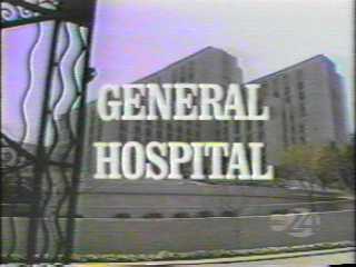
through the gates of the Los Angeles County-USC Medical Center, followed by the
title of the show zooming out toward us. The title is again in white Craw
Clarendon condensed lettering, just as in the 1963 to 1976 openings.
The new theme music, "Autumn Breeze (a.k.a. "Theme from General Hospital")" by Jack Urbont, sounded very closely modeled on David Raksin's Ben Casey theme. Both were in the G major key, both were brass-dominated, and both featured major ninth, thirteenth, augmented and diminished chords.
The end credits were set in the same Craw Clarendon Condensed type as the title logo. On some days, not unlike The Doctors, the credits would list after the production principals a handful of major cast members on separate cards. On long crawl days, cast members were usually grouped based on seniority and current storyline ties.
Part Three: An Anniversary Week of New Beginnings
 Wendy Riche took over as
General Hospital's executive producer at the beginning of 1992. Over a
year later, she would make her most visible change as she decided to retire the
long-running 1976 opening in favor of something new.
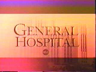
The new opening debuted at the beginning of the April 1, 1993 episode that marked the show's thirtieth anniversary. The theme begins with a heartbeat rhythm played on a bass guitar as we dissolve to a shot of an ambulance. That, in turn, dissolves into a tinted, letterboxed view of the exterior of the LA County-USC Medical Center. This is followed by a series of video headshots of all the contract cast members, either solo or in pairs, against a black background. After every few clips, there is an action clip from the show. At the end of the sequence, we go back to the letterboxed, tinted hospital exterior and the title of the show in Goudy Bold type. During the 2002-2003 season, the characters’ names were added to the opening.
For awhile, the end credits remained in the same Craw Clarendon Condensed type used in past years. Now, however, the long crawl was done over stills from that day's episode. From 1996 to 1999, each end credit segment was done in smaller lettering on a separate card for each still. The separate card setup is still used in the end titles shown on SoapNet rebroadcasts, but the credits are done over a shot of the hospital.
Part Four: ABC Daytime Rebranding of 2004
During the May 2004 sweeps, ABC Daytime began a significant re-branding process. New graphics and new promotional bumpers were created, and the visuals in the new promos were incorporated into new openings that were unveiled on all three ABC soaps in subsequent weeks. On August 30, 2004, GH unveiled a new opening that incorporated many of the character visuals used in a new set of ABC Daytime promos and bumpers that debuted in May 2004. The nods to the show’s past seem quite minimal in this new opening as we get only an extremely brief glimpse of an ambulance and an almost equally brief upward pan of the hospital exterior. This new opening sequence ends with a shot of the male cast members clad in tuxedos and posing against a white background, followed by the name of the show appearing in white letters straight across the screen against a black background and framed by letterboxing.
GENERAL HOSPITAL
The end credits for GH shown on SoapNet are the same as those used before the ABC Daytime rebranding. Same visuals (based on the 1993-2004 opening), same lettering, etc.
Here is a list of the themes used by General Hospital during its run on ABC:
- THEME FROM GENERAL
HOSPITAL
A.K.A. "General Hospital"
ASCAP Title Code: 500150410
Writers: Walton, Kip
Publishers/Administrators: American Broadcasting Music Inc.
ATTN: Debra Leonard
Associate Director - Music Publishing
30 West 67th Street
9th Floor
New York , NY, 10023
(212) 456-3233
Dates of Usage: 1963 to Spring 1975
Copyright Date:
Published Sheet Music:
Recordings: - LP: Theme from Peyton
Place and 11 Other Great Themes"
Frank DeVol
ABC-Paramount Records (ABC-513) (circa 1965) - 45 rpm Single: ABC-Paramount 10628 (1965)
- "GENERAL HOSPITAL
(SIGNATURE)
a.k.a. "GENERAL HOSPITAL" and "New Theme for General Hospital" (Copyright registration title)
ASCAP Title Code: 370116197
Writers: Wright, George
Publishers/Administrators: Fred Bock Music Company Inc., PO Box 570567, Tarzana, CA, 91357. Phone Number: (818) 996-6181
Dates of Usage: Based on correspondence with ASCAP, this theme was used starting in the 2nd Quarter (April to June) of 1975. The probable last airdate for this short-lived theme was Friday, July 23, 1976.
Copyright Date: April 25, 1975 (EU 581561)
Published Sheet Music:
Recordings: - Autumn Breeze
a.k.a. "Theme To General Hospital"
BMI Work #66359
Writers: Urbont, Jack (BMI)
Publishers: ABC Circle Music Inc. (BMI) (Original Publisher: ABC/Dunhill Music, Inc.)
Dates of Usage: Circa July 26, 1976 to March 31, 1993
Copyright Date: July 26, 1976 (EU 701049)
Published Sheet Music:
Recordings: - LP: "Great Love
Themes from Daytime Television"
D'Arneill Pershing and the London Studio Orchestra
(Nova LPS-00001) 1978 - LP: "Soap Opera
Favorites"
D'Arneill Pershing
(Sine Qua Non SQN-5053)
This is a 1986 US release of an album originally issued in Great Britain. - LP: "The Great
Soap Opera Themes"
New Christy Minstrels
Capitol SL-8076/Springboard TVP-1011 - "Your Favorite
Soap Opera Themes"
Performed by Bill Bartholomew
MMR Productions MMRP-2200 (1986) - CD: "Themes of
Our Lives"
Hollywood TV Pops
Intersound PCD-510 (1990)
Re-released in 1991 as "Hits of the Soaps"
First Choice FC-4522 (1991) - Faces Of The Heart
(Legal Title)
a.k.a. "General Hospital Theme"
BMI Work #1857756
Writers: Koz, David S (BMI); Koz, Jeff (BMI); Urbont, Jack (BMI)
Publishers: ABC Circle Music Inc (BMI)
Artist: Koz, Dave
Dates of Usage: Thursday, April 1, 1993 to present
Copyright Date:
Published Sheet Music:
Recordings: - CD: "Lucky
Man"
Dave Koz
Capitol CDP7-98892-2 (1993) - Single: Capitol 4KM-58008-4 (1993)
Here is one great General Hospital website you can visit:
Soap Zone: General Hospital at http://soapzone.com/gh/.